In the 1990s websites were flooded with flashing and blinking banners and the mid-2000s saw a proliferation of rounded corners which today look extremely dated. Yet, it isn’t just the aesthetics that are constantly evolving, it’s important to take into account increased connectivity, how visitors will access your site and their browsing habits.
It’s amazing how technology and tastes move on so quickly. One minute you have a perfectly acceptable website and the next you’re worrying whether it looks retro or just plain old-fashioned… an out-dated website design can be a real turn-off and damage your credibility. So as we approach the end of the year, we’ve taken a look at predictions from a range of ‘techies’ and design professionals for website design trends for 2015.
Here are Redline Company’s top five predictions:
1 Responsive templates (optimised for mobiles and iPads)
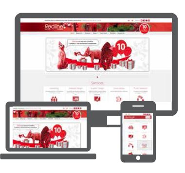
If current trends continue, 2015 will see mobile devices overtake traditional computers as the preferred method of accessing websites. This is massive, as it means that ‘mobile first’ responsive templates will be more important than ever. A responsive design detects the size of the screen used and adapts accordingly. Redline’s web designers have been recommending responsive templates instead of apps and mobile sites for a while now. It’s no longer considered to be best practice to create a general information website using different templates for the desktop and mobile sites, as updates for new mobile devices don’t happen automatically and often leave the mobile sites out of date. A responsive template saves you future development time and money by adapting to constant technological changes, whilst providing the required user experience.
2 Greater emphasis on creative visuals
There is a definite trend towards using more imagery supported by well-chosen words, rather than text with a few photos. It’s all about large images, icons and info graphics. Combining text with videos and photos delivers the message, entertains and holds the attention. Research undertaken by MIT’s Department of Brain and Cognitive Sciences* has shown the brain to be remarkably adept at processing this type of information.
3 Fewer pages and more scrolling
Today’s mobile users are driving the trend towards increased scrolling functionality as the preferred method of accessing information. Even though multiple pages are good for SEO, you need to accommodate your visitors, who are likely to be using a tablet or smartphone.
4 Individual typography
Everything has its day and now is the time to say goodbye to generic typeface and familiar fonts like Ariel, Ventura and times New Roman. The future is all about mixing it up, using different fonts and typography to draw attention to specific areas of text and give it some presonality.
5 Flat design
The introduction of Windows 8 has set the stage for ‘flat design’ to become the preferred choice. Today’s minimal designs don’t have shadows, bevels or textures instead colour is used to attract attention. The benefits of this type of design are twofold; you get a great looking clean modern site and the simplicity of the design makes the sites quick to load for the viewer.
* Dr Ruth Rosenholz, Principal Research Scientist, Massachusetts Institute of Technology


